Concepted for Cox social, this very loose and quick video was a labor of love to show how much fun it can be to work at a Cox Enterprises company.
Screenshot from LinkedIn one day after posting shows enormous traction.
Concept, Production, Videography and Editing by DLK.
Blended Family spirits is a new line of all natural liqueurs made by hand in Roswell, Ga. Using only the finest botanicals and locally sourced ingredients, the brand prides itself on being the only product line of its kind produced in the U.S.
Thus, Blended Family commanded a home grown look and feel that would evoke scenes familiar to Americana and vintage iconography to communicate quality. Think barn advertising, the Sears and Roebuck Catalog, vintage travel postcards and the like.
Combining a softer sans serif typeface that would feel at home on a hand painted sign, along with an upbeat script, the logo reinforces the idea of elements coming together to produce something authentic and natural. Paired with custom watercolor imagery, the labels are inviting and wholesome.
Design, art direction and copywriting by David Lukas Kühn
841 Memorial is a collection of apartment homes intelligently designed with comfort in mind. Complete with a courtyard, community herb garden and stunning Atlanta views from our rooftop deck, a gigabit wi-fi enabled lifestyle awaits you in the heart of Historic Reynoldstown.
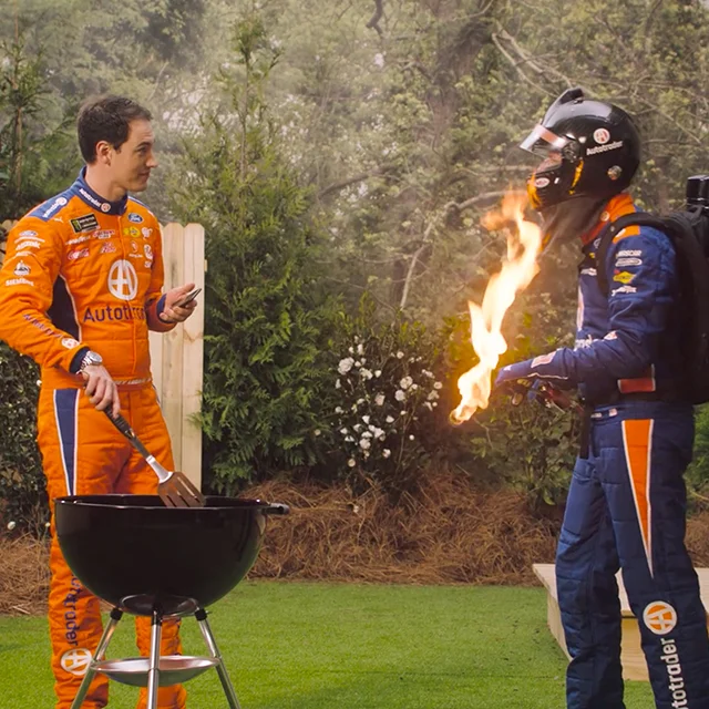
Through spoofs on historical modes of transportation, this national campaign declares that car shopping is finally easy with Autotrader.
The humorous television ads running in prime placements provide a cultural point of reference and creative umbrella under which targeted digital ads call in market shoppers to action and link to the Autotrader site.
Once the new tagline was established, placement of “non-campaign” ads was also possible, adding flexibility to creative not tied to the television spots.
With Autotrader, you can Accelerate your deal and save time at the dealership by submitting your paperwork before you even get to the showroom.
In this series, Autotrader NASCAR drivers Joey Logano and Brad Keselowski go a step beyond and accelerate other things.
David Lukas Kühn, Concept and Art Direction.
[More being added here]
Leading the concept team for consumer social media for the Autotrader and Kelley Blue Book brands, I was challenged with creating posts that bolstered brand pillars and RTBs (“reasons to believe”), while also aligning with the brand promises of pain-free car shopping and the ultimate source for automotive expertise, respectively.
I sought to develop mini campaigns that could own these brand pillars while telling unique stories and emerge in a sea of social bombardment. Opportunities also presented themselves to invite engagement and participation from an audience of car enthusiasts while pointing them to brand editorial content.
Marketing the brand products like the Kelley Blue Book Price Advisor also inspired moments of invention and chances to create custom imagery.
2019 metrics prove the concepts to be very successful:
Autotrader:
41.5M impressions
520.4K engagements
60.1K clicks
Kelley Blue Book:
68.4M impressions
820.4K engagements
132.3K clicks
The Expat is a bistro and bar in the Five Points neighborhood of Athens, GA. The menu is inspired by classic French bistro and European dishes, as well as the changing seasons and the exceptional ingredients available from local farmers and purveyors.
The identity is inspired by the service of bygone eras, from perfume counters at department stores to the classic cocktail culture of the 20’s and 30s.
The Woodruff Arts Center Annual Corporate Campaign is the center’s way to engage its benefactors and illustrate how and where their generous contributions are bring used.
The concept of “Form + Function” developed as a way to showcase the renowned artists and exhibits (the what) that highlighted the year while also diving into the dedication and work (the how) that goes into curating and presenting these cultural milestones.
The book was designed as a “turn and flip,” where once the reader finished one half, it could be flipped over and read in the other direction. Schematic drawings and artfully illustrated financials helped explain the efforts of the staff and the generosity of the donors.
Logos I’ve designed for a range of clients.
Georgia-Pacific Professional, looking to position itself as more than just a “hand washing” company, sought to prove itself deeply in tune with its customer’s challenges.
One of its largest segment opportunities is class-A property managers for office buildings, and in promoting its “Office Building of the Future” positioning, I conceived the idea to step into that future at the Building Owners and Managers Association conference.
We curated the property manager journey with GP Pro to elevate washrooms from afterthought to essential, inspire a new vision for how to evolve washrooms in a densified world and expand perception of the value GP Pro can provide through insights into trends and changes just around the corner.
The concept of “My World. My Story.” was tailored to invite BOMA registration and a customized experience through a video direct mail piece intended to land in the hands of customers and cut through the noise of the digital inbox.
Customers registered for a GP Pro Pro Pass, an RFID enabled key card that could serve as their personalized name badge at the conference.
Each customer would encounter unique messaging through a personal concierge experience triggered on installed video walls by their Pro Pass that was directly linked to their profile, position and property.
A follow-up email would resume the conversation after the conference.
Great photography is an essential part of any successful brand, and I have been lucky to direct a number of successful photo shoots. Collaborating with amazing photographers is definitely a rewarding experience; I've even taken it upon myself to shoot some b-roll when necessary.
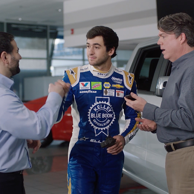
Kelley Blue Book is the industry expert in car buying research and pricing. When you're in the middle of a negotiation at a dealership, sometimes you just want to get to the point and come to terms. Chase Elliot is the perfect guy to help.
David Lukas Kühn, Concept and Art Direction.
In order to drive the value of partnering with Cox Automotive and Autotrader, an integrated campaign – consisting of emails and trade periodical tip-ins pointed to landing pages – was designed for current clients reinforcing the strong site performance delivered by new product launches like Accelerate. The marketing campaign reinforced Autotrader as their main ally for delivering more leads and engagement.
Cox Automotive +One is a B2B initiative to establish more personalized relationships with individual customers to prioritize their business needs and to ensure this focus will serve to positively impact and grow their endeavors.
Following the mantra of “Listen+Learn+Solve,” a suite of marketing tools was created including a customizable branded presentation deck with embedded video links and animated infographics.
Matching landing pages expand upon the program and provide a repository of all information and pertinent links.
To build internal support and create a face for the program, branded stationery and swag is also part of the arsenal of account tools.
Clemson University was looking for a new academic brand campaign to raise awareness about the innovative work being done on campus by exceptional and driven faculty.
The concept of “Head On” was developed to encapsulate the determined spirit with which the university and its people meet challenges.
A series of peer publication ads were created to drive traffic to landing pages highlighting select faculty with accompanying feature videos.
David Lukas Kühn, Concept and Art Direction.
Mobile is the main touchpoint for your audience, and responsive web design is the most efficient way to maintain your web presence. My goal is always a clean and intuitive interface that answers questions rather than provoking them.
Virginia Tech needed a fresh brand identity for its new $100M Center for the Arts, established as the region's go-to destination for cultural exposition, while also allowing a new breed of collaborations between the foremost scientific and artistic minds.
The brand had specific needs to exhibit the many perspectives that combined to form its identity. The ideas of collaboration and intersection inform the look and feel, from the gestural "V" and "A" mirroring each other in the logo, to the juxtapositions of texture, photography and geometry.
A new organizational model in ICAT (Institute for Creativity, Arts and Technology) was created, a research institute within the CFA where artists, designers, engineers and scientists come together in a living laboratory that fosters creativity and innovation.
This sub-brand of the CFA was fit for conveying more experimental and technological outcomes, as literally anything was possible here.
An interface was created that would allow for "Live Look-ins" of the various research and performance spaces within ICAT. Here, one could actually see the breakthroughs in art and science as they happen.
Oglethrope University established a new interdisciplinary program to engage students with customized curriculum, allowing them to explore the world through unique perspectives and filters of their own creation.
The brand for the A_LAB was developed to represent this modular approach to research and learning. The logo itself becomes a container for areas of study bolstered by a dynamic toolbox of textures, filters and jewel tones.
David Lukas Kühn, Concept and Art Direction.
This nationally televised commercial for Clemson University's academic brand was shown during all Clemson Tiger NCAA division one football games. I had a great time leading many aspects of this production, from scripting, scheduling and art directing video shoots to editing and post production work to make this dynamic piece come together.
More than just "the test people," it was important to expand awareness of NCEES as a lifelong resource in the careers of engineers and surveyors while offering the council a modern and functional brand.
The engineer's mindset becomes the intentional framework around which unique perspectives and authentic, handwritten formulations are assembled to express the relevance of NCEES' services to a diverse audience.
The result is a palette rich in familiar devices applicable across a variety of media, making for instant recognition and easy ownership of the new brand.
Hope College, a research-oriented small liberal arts college in Holland, Michigan, carried a reputation as a christian school Founded by Dutch immigrant members of the Reformed Church. The college is known today for combining non-prescriptive exploration of faith and purpose with high quality programs in the humanities, sciences and the arts. A brand refresh was in order highlight the new Hope.
Recent shifts in the economy created the need for Austin Seminary to define their unique position as an astute center for post-graduate study, a diverse body of cross-generational theological thinkers and a culture of personal involvement requiring on-campus living.
As the paths of individuals at APTS are molded through deep thinking, thoughtful service and the exchange of ideas, the concept of residential formation allows the school's way of life to be conveyed using natural forms and layering.
The new brand identity concept presents a progressive look that nods to the organic essence of personal growth.
The alumni magazine for the J. Mack Robinson College of Business at Georgia State University is an award-winning semiannual full of the latest in Robinson College news, business trends and features with key players, both local and international.
At the helm of each issue's design, cover to cover, I was afforded the opportunity to work with a diverse mix of subjects from Shirley Franklin to Bill Rogers. One of the most satisfying aspects of the process was planning and art directing custom photoshoots for specific cover stories and articles.
In a period of transition, Reinhardt needed a refreshed brand identity to elevate the perception of its institution after obtaining university status.
The campus' graphic architectural features inspired a contemporary brand highlighting the fresh face of a dynamic learning environment, an active campus and the richness of the Reinhardt's geographic location.
Enrollment grew upon implementation of the new materials and interactive resources, and the in-house creative team adopted the concept with consistency.
“12 Days of Resource Christmas”
First is a stop motion animation was created as a holiday card for Resource Branding & Design, Atlanta, Ga. New lyrics were written to the tune of “The Twelve Days of Christmas” and then set to a stop motion compiled from original photography.
I had a lot of fun with this, storyboarding each scene, art directing and shooting all of the images and editing them together. Yep, that's me playing and singing the new song. I engineered the recording and edited all of this together. It was one of the most well-received pieces of original content Resource had created in a while, all of which drove traffic to their new site.
“Be Moved.”
Building powerful brands that create meaningful results is a team sport for sure. Everyone brings valuable, unique perspectives to the table. Getting everyone moving in the same direction requires alignment, internal and external.
A newly developed building project in downtown Nashville, Tn needed a way to showcase the amenities and lifestyle promised to new tenants, both commercial and residential.
Curated footage and artists renderings were combined as a homepage hero loop to portray the modern conveniences that awaited the diverse audience.